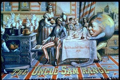
The first image is an advertisement for " The Uncle Sam Range" created in 1876. The composition of the poster is misleading as the product is placed on the far left of the poster and a part of it is out of the poster and wihtout a prior knowledge it was not obvious what the poster was advertising. The viewer's attention is immediately drawn to the illustration of an upper class American family dining. The poster is complicated and full of information. There are crude and suggestive illustrations of patriotism all aorund the room. The way that the man is dressed, the curtains and carpet are clearly drawn using the colours of the american flag. The type is very western and associated to the wild west suggesting industrialisation, revolution, and civilization. As mentioned, the purpose of the image is to advertise a range. However, rather than advertising ther porduct by its virtue and quality, the company is advertising it through patriotism and aspiration.The faimly using this cooker is a stereotypical upper class family that people may aspire to be like.The image of the world being fed by America and holding the paid bill of fare showing all the contents of the food required by other countries.The poster was also created during the celebration fo America's hundreth year to independence and that fact is being used to the product's advantage. The clock indicates the hundred years of America's independence. The company took this opportunity to sell their range by showing that "The Uncle Sam Range" which is an all american cooker will represent their patriotism towards their country. The poster's main target are the middle working class people as they still aspire to be in the upper class and also can afford to by a range.

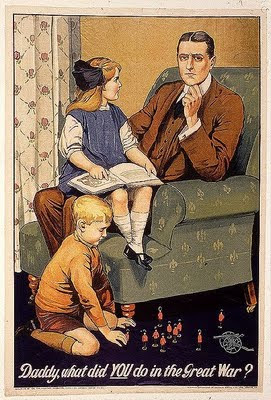
The second poster is a propaganda for men to join the army in 1915. In contrast to the first poster, it is quite simple and direct. The man in the poster looks straight into the audience's eyes making the message personal. Instead of using the typeface to communicate the message it is the way the type is arranged. The word you is capitalized and underlined to make it personal and war to be is already referred to as the great war implying that it will be victorious for England and it would be called The Great War. The method of getting through to the audience is similar to the first poster as the creater uses aspiration to get people to join th army. The man seems middle or upper class with two children indicating the result of the war. Similarly to the first poster, in a less obvious way, the propaganda also uses pratiotism to persuade people.For example, the subtle print of the red rose on the curtains and the boy playing with English toy soldiers glamoruing the idea of war. This poster targetted middle class men and many of the working class men would have already joined as they may have less to lose. The poster was created in 1915 before force conscription and the numbers dropped as the middle/upper class men were not as willing to join. The two posters use the same startegy to persuade people but the choice of type and imagery were very different.
